top of page
Thompson Woods Preserve
Signage and Wayfinding System Design
November 2023 - December 2023
This project is the culmination of ART 570 - Graduate Graphic Design Studio. The research phase involved close collaboration among first and second-year graduate students. Developed in partnership with Penn State Sustainability and the State College Borough, the design was showcased at the 2023 Campus and Community Sustainability Expo.

Project brief
Thompson Woods Preserve is a 43.36-acre area close to downtown State College and Pennsylvania State University, offering trails and natural sights to the public. However, there’s a significant issue at the preserve: the complete lack of signage. By introducing clear and educational signs, the preserve can become easier to navigate and more informative for visitors. This would enhance the overall experience, promoting a better understanding and appreciation of the local ecology and encouraging responsible enjoyment of this natural space.
Problem
The Thompson Woods Preserve currently suffers from a lack of signage. This absence of directional and informational signs can lead to visitor confusion, potential damage to sensitive areas due to unintended off-trail hiking, and a lack of awareness about the ecological significance of the preserve.
Goals
Enhancing Navigation with Clear Wayfinding in TWP
Informative Signage for Education and Awareness
Accessible and Inclusive Signage for All Visitors
Sustainable Signage Design
Research
Our research method was structured around the 5E model, an Experience Design framework that is instrumental in creating meaningful services, events, or learning experiences. This model is designed to guide the creation of experiences that yield significant and valuable outcomes, ensuring a holistic and impactful user journey.
In the context of Thompson Woods Preserve, we applied the first three stages of the 5E’s framework—Entice, Enter, and Engage—to enhance the visitor experience. By focusing on these initial stages, our approach was tailored to captivate visitors from the moment they first become aware of the preserve, facilitate their entrance and orientation within the space, and deeply engage them during their visit, thereby ensuring a comprehensive and enriched interaction with the natural environment.
Entice
Enter
Engage
Exit
Extend
Awareness and attraction to the experience
Entering into
the designed experience
The main activity that capture the attention of participant
The clear
end of the experience
A physical or digital object to take home and remember the experience
Site Analysis
Upon visiting Thompson Woods Preserve, We noticed several issues with the current signage system. The wooden signs, though rustic, have aged significantly and could use a refresh. There’s a distinct lack of uniformity in terms of size and shape, which can affect a visitor’s experience. More importantly, some areas don’t have any signs, leaving visitors unsure of directions or points of interest. Additionally, a few of the existing signs can be a bit confusing due to their design or location. A well-thought-out update would enhance navigation and overall visitor experience within the preserve.


Trafic Flow and Important Nodes
Thompson Woods Preserve features four entrances, including one main entry point equipped with a parking area. However, navigating the preserve can be quite challenging due to the presence of numerous nodes and pathways that lack clear signage.

User Persona and User Journey Map
By creating detailed personas, we were able to empathize with our target audience, understand their needs, behaviors, and preferences. This insight, combined with a user journey map, allowed us to visualize the entire experience of visitors in TWP and guided us to design solutions that were not only intuitive but also deeply resonant with our users’ expectations and experiences.
.jpg)
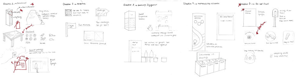
Early Sketches
The early sketches of the project are rough yet insightful. These drawings serve as a crucial starting point, outlining basic ideas and guiding the project’s evolution from abstract thoughts to tangible designs.
Brand System Design
The branding design for the project emphasizes its connection to nature through a color palette of greens and browns, mirroring the natural scenery of the preserve. These colors are selected to resonate with the outdoor setting, bringing to mind the trees, foliage, and earth. This thoughtful blend of colors and type creates a cohesive brand identity that captures the essence of the preserve’s natural beauty.

Iconography
A positive approach was adopted for the design of “DO” and “Don’t” icons. The “Do” icons are welcoming, promoting positive actions, while the “Don’t” icons gently educate rather than reprimand for creating a friendly and informative atmosphere.
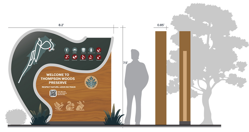
Final Signage Design
The signage system for Thompson Woods Preserve combines functionality with natural aesthetics. Visitors are welcomed by a main entrance sign displaying essential information, while a secondary sign provides a quick overview and map. Directional signs with intuitive symbols guide the way, and educational panels highlight the local ecology. For children, engaging animal puzzles offer interactive learning.
Location of each signage on the map


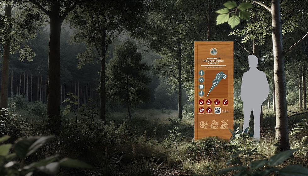
Main Entrance Signage
A welcoming display with the preserve's name and essential information, offering an inviting first impression at the primary entry point.
Second Entrance Signage
A smaller, informative sign at the second entrance, providing a brief overview and a map of the preserve.

Directional Signage
Clear, simple signs with arrows and symbols to guide visitors along trails and to key points of interest.

Educational Signage
Earth: Highlighting the variety of plants and their ecological roles
Water: Information on the ecosystem's water bodies
Fire: Insights into controlled burns and forest health
Wind: Details on wind's role in seed dispersal and tree growth

Kids’ Signage (Animal Puzzles)
Interactive puzzle signs focused on the animals in the woods, designed to engage and educate young visitors.

Material (Wood + Metal)
Cedar Wood: Selected for its natural durability and weather resistance, ideal for the East Coast's climate.
Steel: Used for its distinctive, natural dark brownish-red color and durability, providing a striking visual contrast.
Concrete: Incorporated for its robustness and longevity, complementing the other materials in strength and stability.

bottom of page