top of page

SuzanneCollinsBooks
A website that showcases author Suzanne Collins's works and biography.
October 2020- November 2020
Project brief
Suzanne Collins (born August 10, 1962) is an American television writer and author. This project was focused on redesigning her website as a practice that concentrates on the heuristic evaluation and card sorting as the primary research method. I focused more on the UX design aspect rather than on designing the User Interface. Our mid-fi wireframes can be used for UI design in the next step.

Empathize
Heuristic Evaluation
Competitive Analysis
User Interviews

Insight
Conducting Card Sorting
Designing Site Maps
Designing The User Flow

Ideate
Early Design Sketches
Designing Prototype In Figma
Conducting Usability Testing

Prototype
Designing The Final Prototype
Problem
The original website does not represent the author comprehensively. Users will get lost trying to find the information they need. Also, the aesthetics of the website is not appealing at all.
Goals
Designing a better navigation path for the user.
Representing the author and her works in a better way.
Providing more consistency, freedom, and flexibility for the user.
Research
Since this was an existing website, I started with Heuristic Evaluation to identify as many issues as I can, based on Jakob Nielsen's 10 general principles for interaction design. The other research methods that I used were competitive analysis, user interviews, and card sorting which provided a site map and user flow at the end.
Heuristic Evaluation
.png)
Competitive Analysis
For competitive analysis, I reviewed 6 authors' websites and compared their features and layouts. This gave me a good understanding of what the overall architecture of our website should look like and helped a lot with the card-sorting stage.
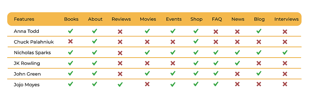.png)

User Interviews

Card Sorting
Based on the subjects and features on the existing website, user interviews, and competitive analysis I came up with 64 cards, and after removing the similar cards, 54 remained. I asked 9 participants to sort the cards into their desired categories and arranged the results in a table.
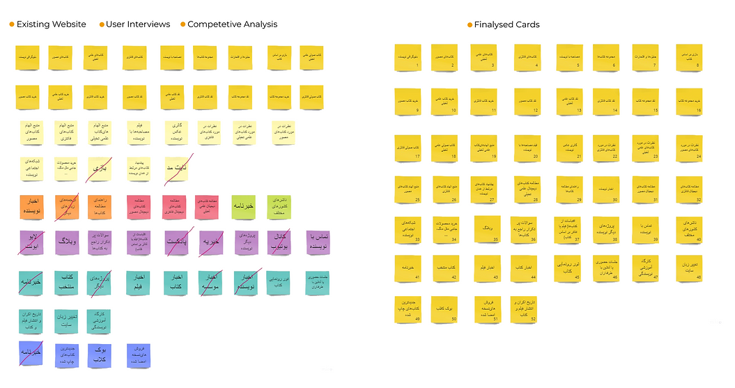

(Since the original table is too long, only the first few rows are showcased here.)
Site Map
After completing the card sorting stage, I had a good understanding of what the most repeated categories were. So I went on to design the site map based on those categories. I started by determining the main navigation menu and then placed the subsets under each category.

User Flow
The user flow follows the task of a user entering the website, finding a book, reading about it, and buying it. Along the way, users can decide to check out other categories and also read the reviews and FAQs.

Early Design sketches

Usability Testing
.png)

Next Steps
1. Designing a more intuitive and intriguing interface.
2. Designing a mobile application.
3. Conducting more usability testing.
You may also like...
bottom of page